
Notifications
Designing a calm, manageable system to deliver information about important system events
Table of Contents


Oh hi there! It's Nick, I’m the platform design lead who led the re-design for VMware Notifications …
… that should help you get a sense of the state of the user experience. I’d love to tell you about the business and market contexts next

The business strategy — its reliance on products evolving independently within their own markets — was contributing to the user experience issues, therefore …
… but there were opportunities for platform-level design solutions. Before we get to the final work, I’d love to set the market context next
In light of these user problems, and along with the business and market problems discussed earlier …
… how’s a product designer to solve notifications for a consistent, platform-level solution? I’d like to give you a sense of the final work, then talk more about how I did it


Once Upon a Time in an IT Department
Once Upon a Time in an IT Department
Shrita Ray manages datacenter operations for Pepsi
She has a lot on her plate, from keeping the servers up-and-running …
… to keeping her stakeholders happy and informed
The last thing she needs is her tools to annoy her while she’s trying to work
Unfortunately, her VMware tools annoy her to no end …
… Robbing her of her patience and focus
The Business Context
VMware's business model is built on an array of business units…
…each targeting their own market segment
There's no incentive for a unified approach across products, therefore
The Market Context
Notifications is the key pain point when monitoring infrastructure
… and that market is on track to double through 2024
VMware is not a player in that market …
… only having been able to capture 6% of the current market pie


Another common use case for VMware notifications is to provide visibility into status
Here’s how one product was handling status messaging, putting it into the product context
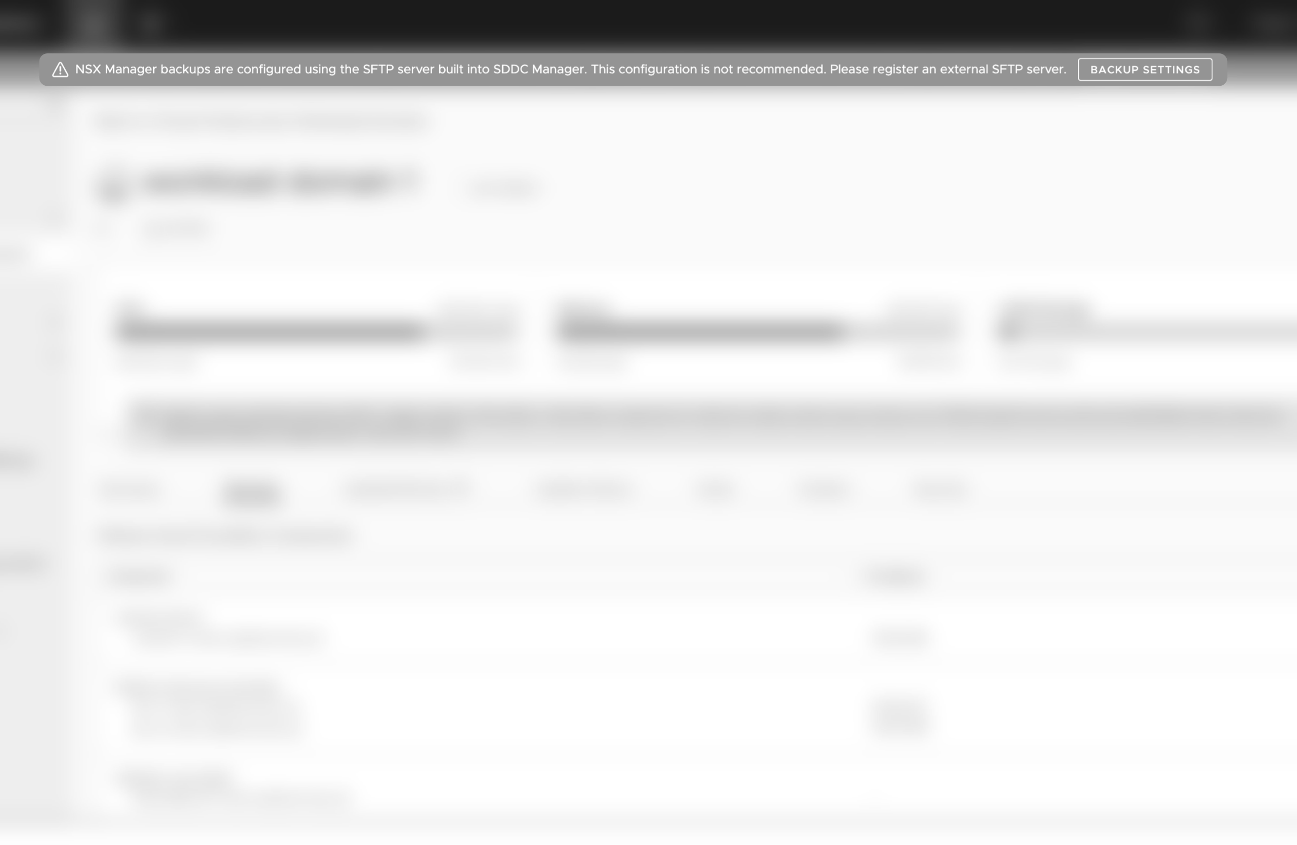
Another product handled status messaging differently
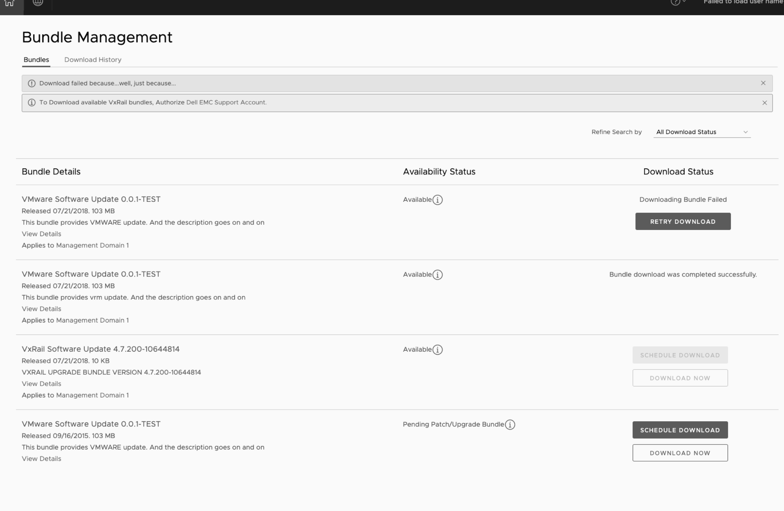
Placing status messages at the top of the application
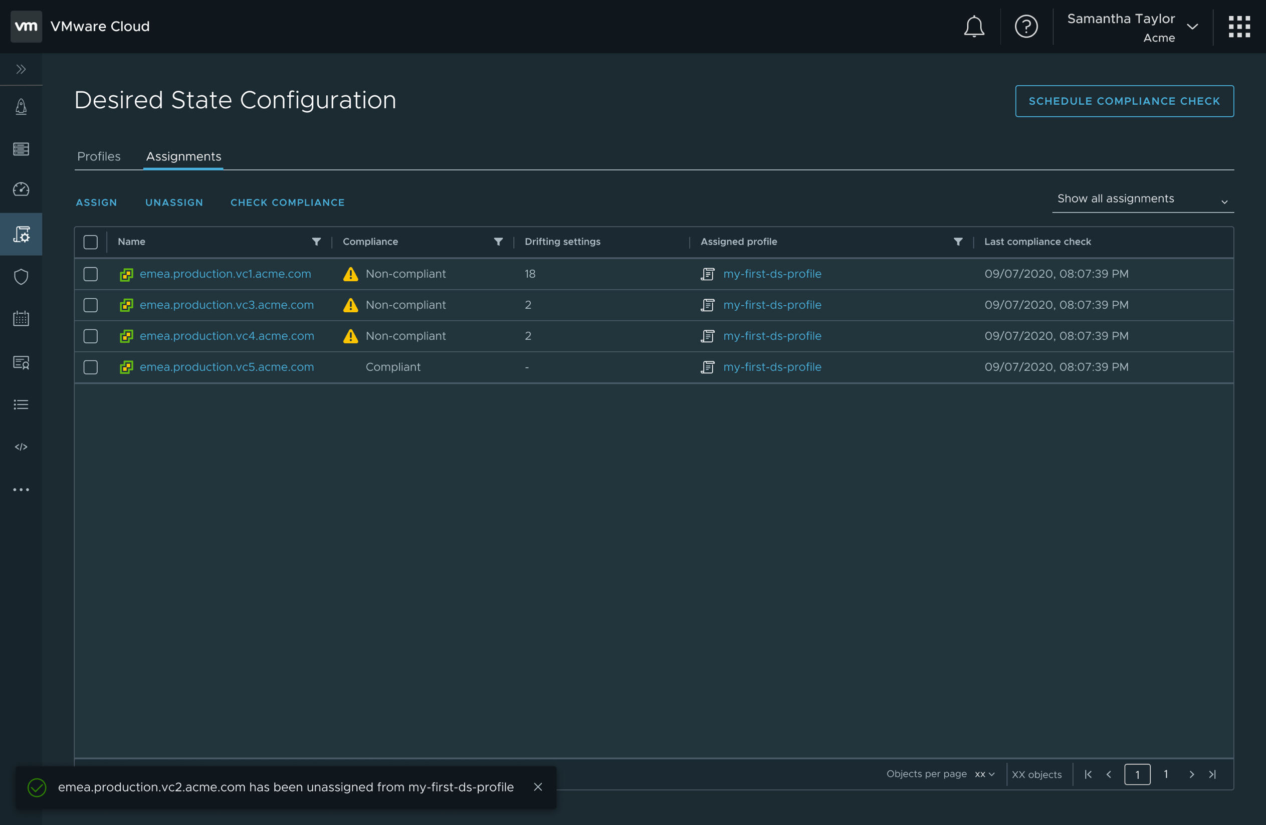
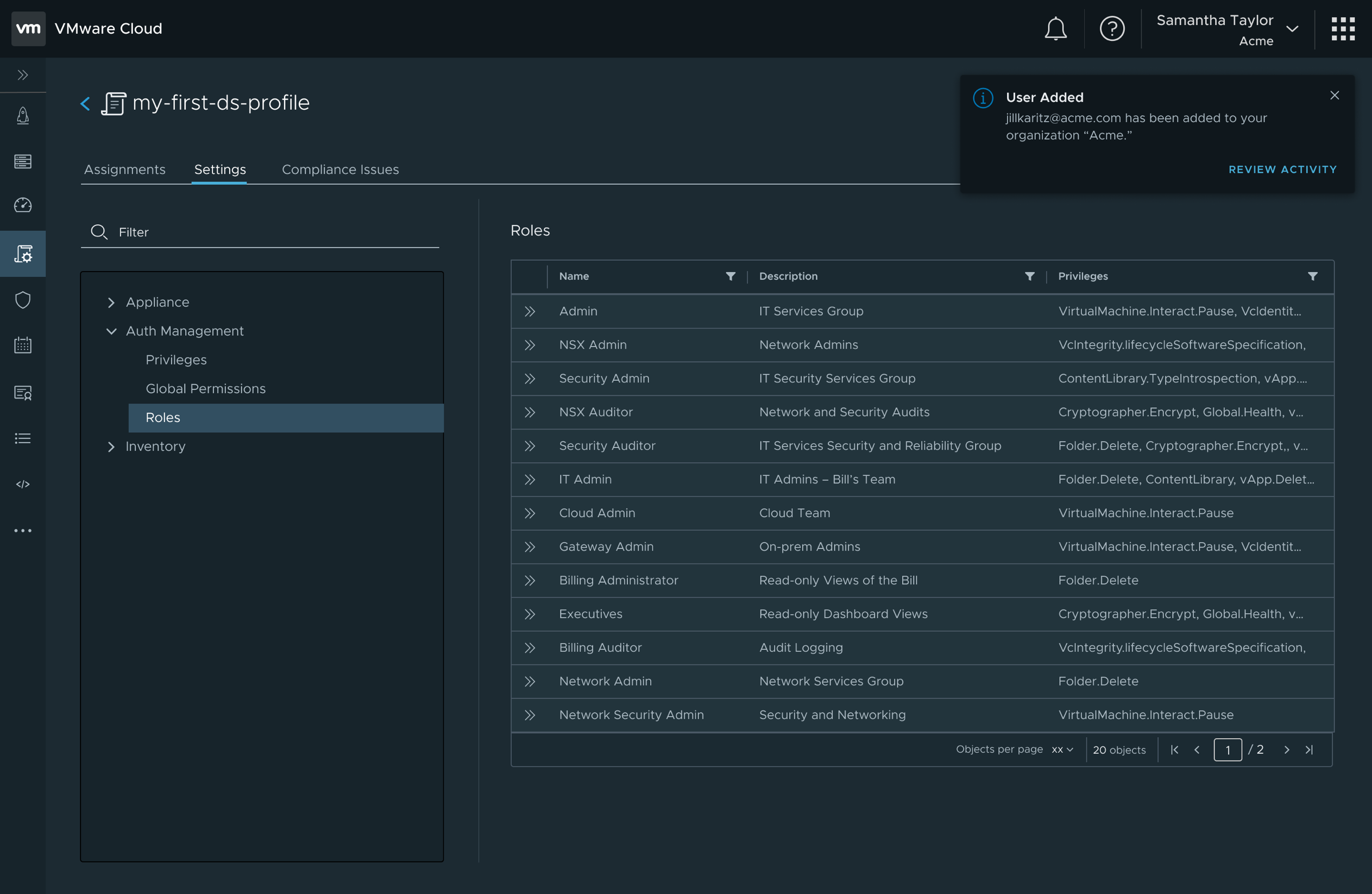
I drove us towards toast notifications for status messaging
Toast messages leverage the same interaction and accessibility design as the snackbar, enabling the initial pieces of a notifications system
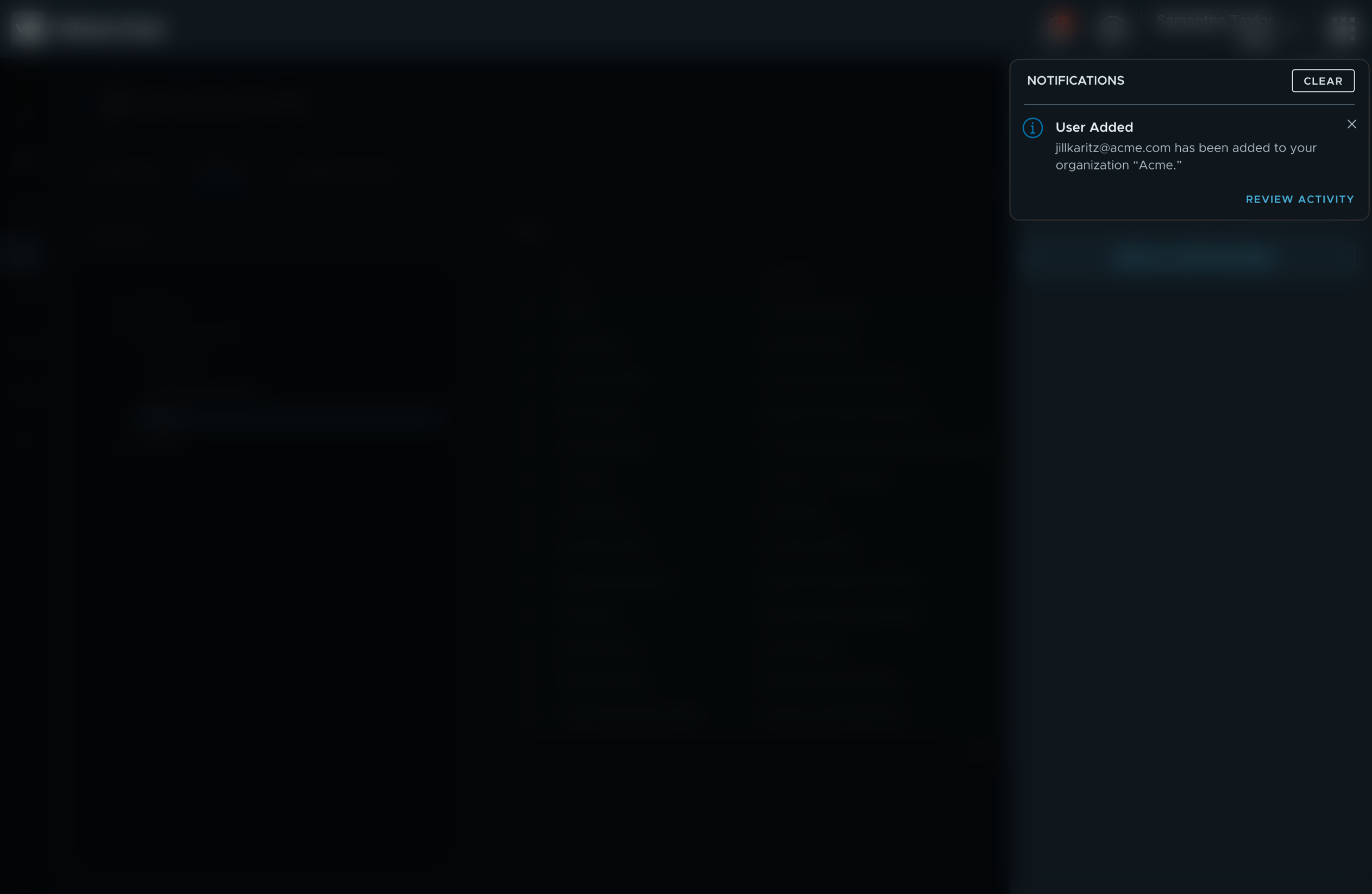
After notifications dismiss themselves from the view, they are available in a side panel for review and action
The MVP designs delivered basic capabilities to receive and act on notifications, but the vision delivers “Do Not Disturb” and filtering

The biggest challenge in creating a consistent experience was unifying the approach across products …
… When I joined, products had implemented a disjointed array of notification patterns, styles, languages, etc …
Confirmations, for example, were handled in many different ways in VMware’s many products
Here’s how another VMware product was handling confirmations
I introduced a snackbar confirmation that helps unpack complex interfaces
The confirmation appears on screen for 6 seconds then disappears. Aria live regions are leveraged to insure A11Y support for screen readers
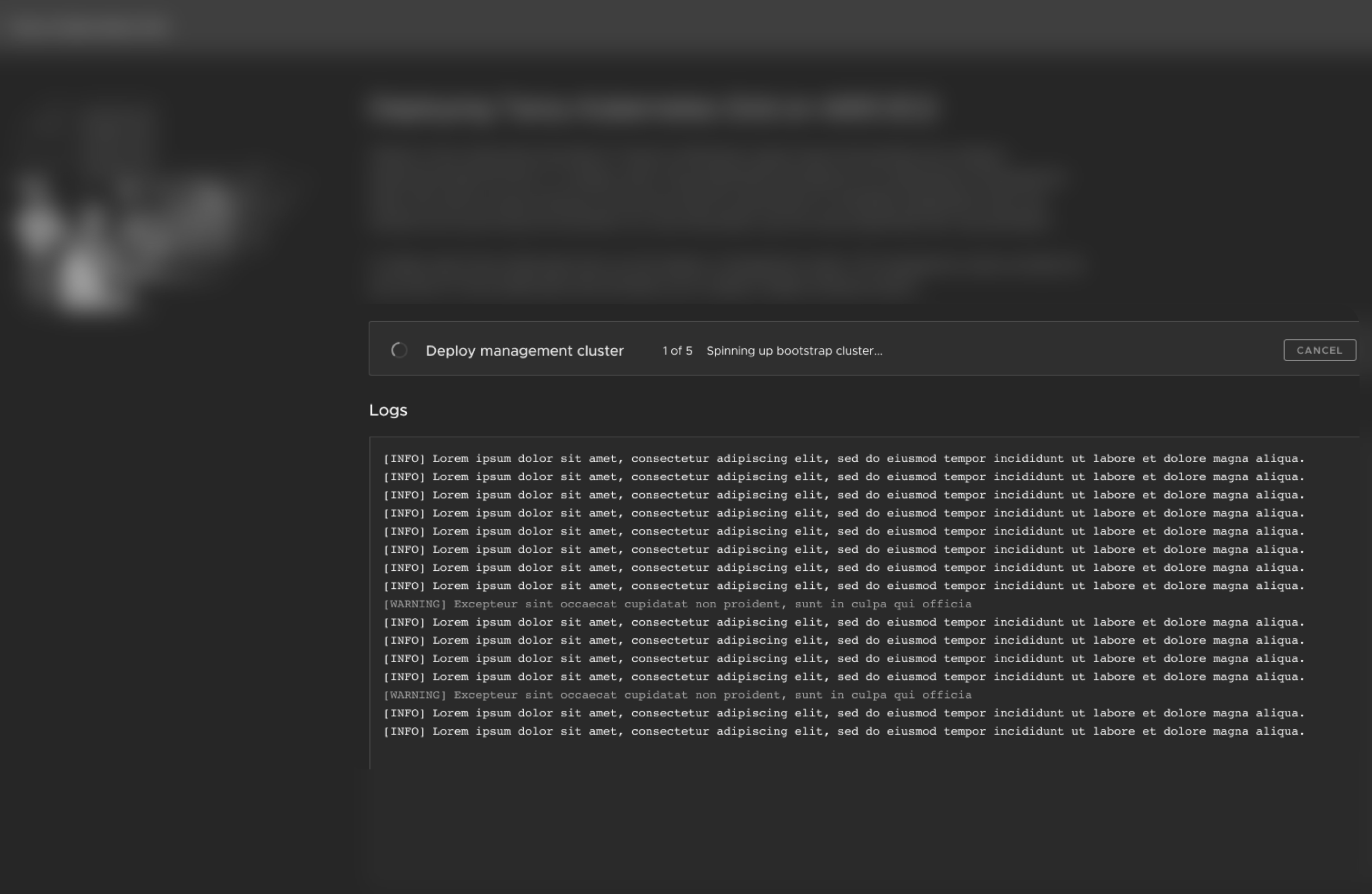
Long running tasks was another area of opportunity for platform level design solution
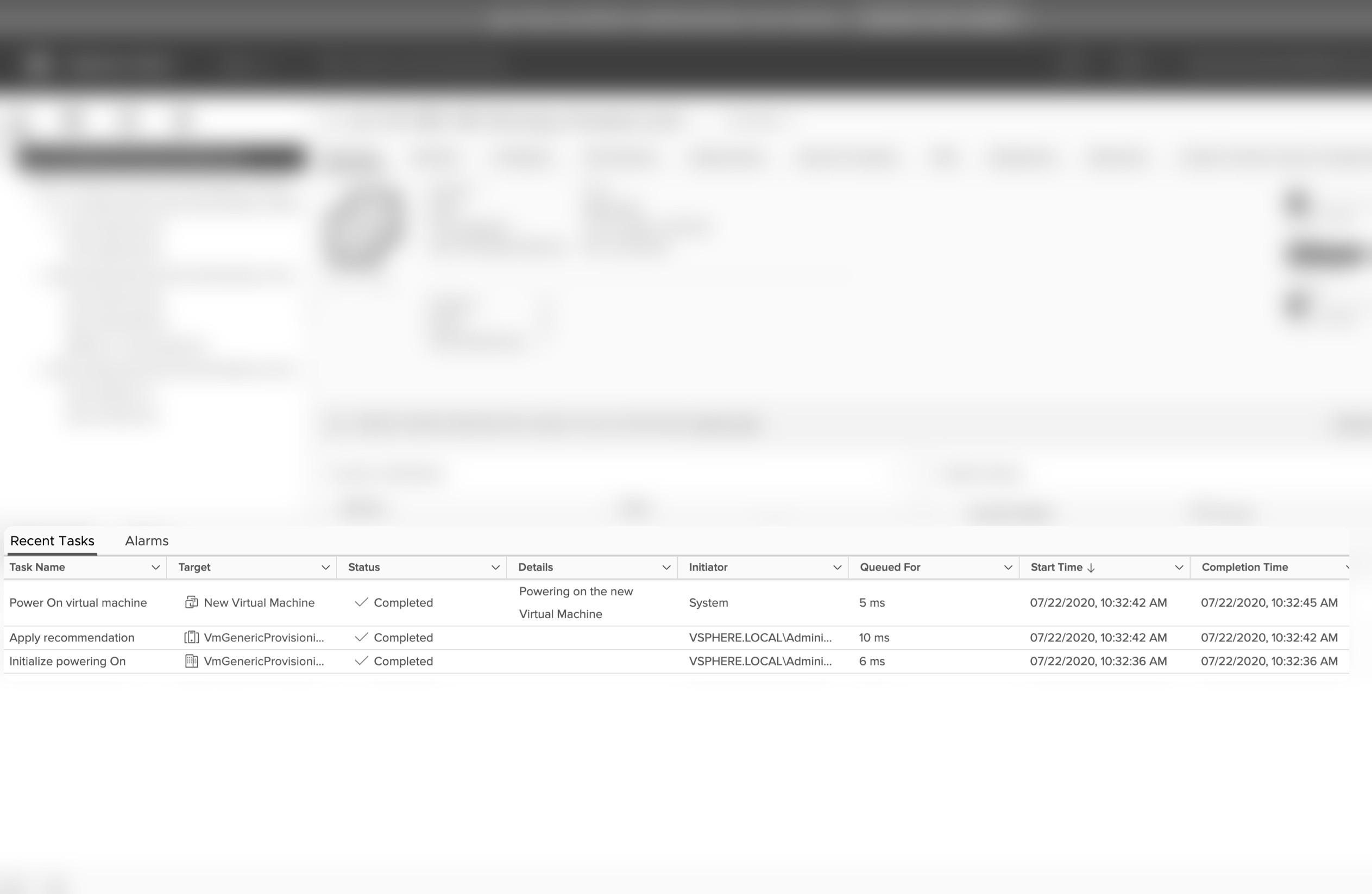
Some products had surfaced them globally in a bottom bar
Whereas others were keeping them in the context of a specific page
So users had to come back here to check statuses of tasks they are waiting to complete
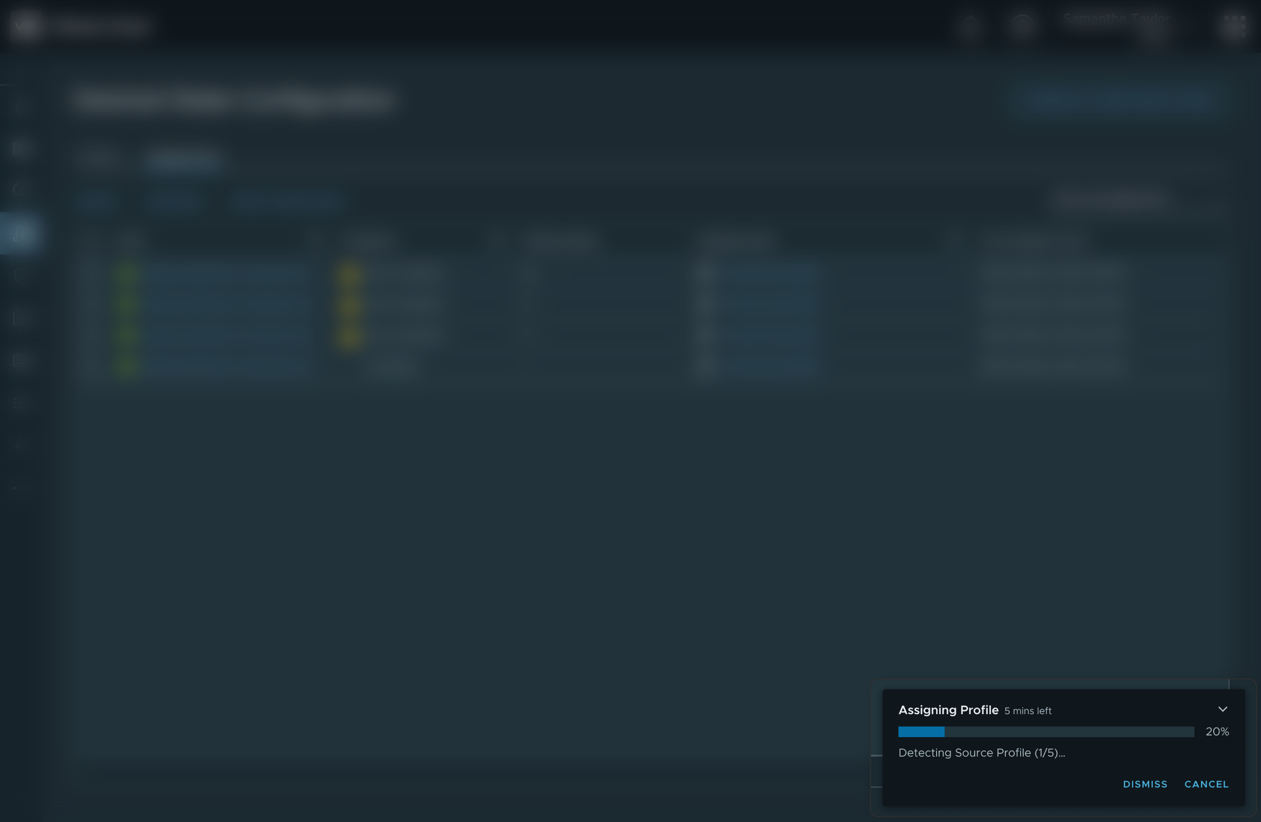
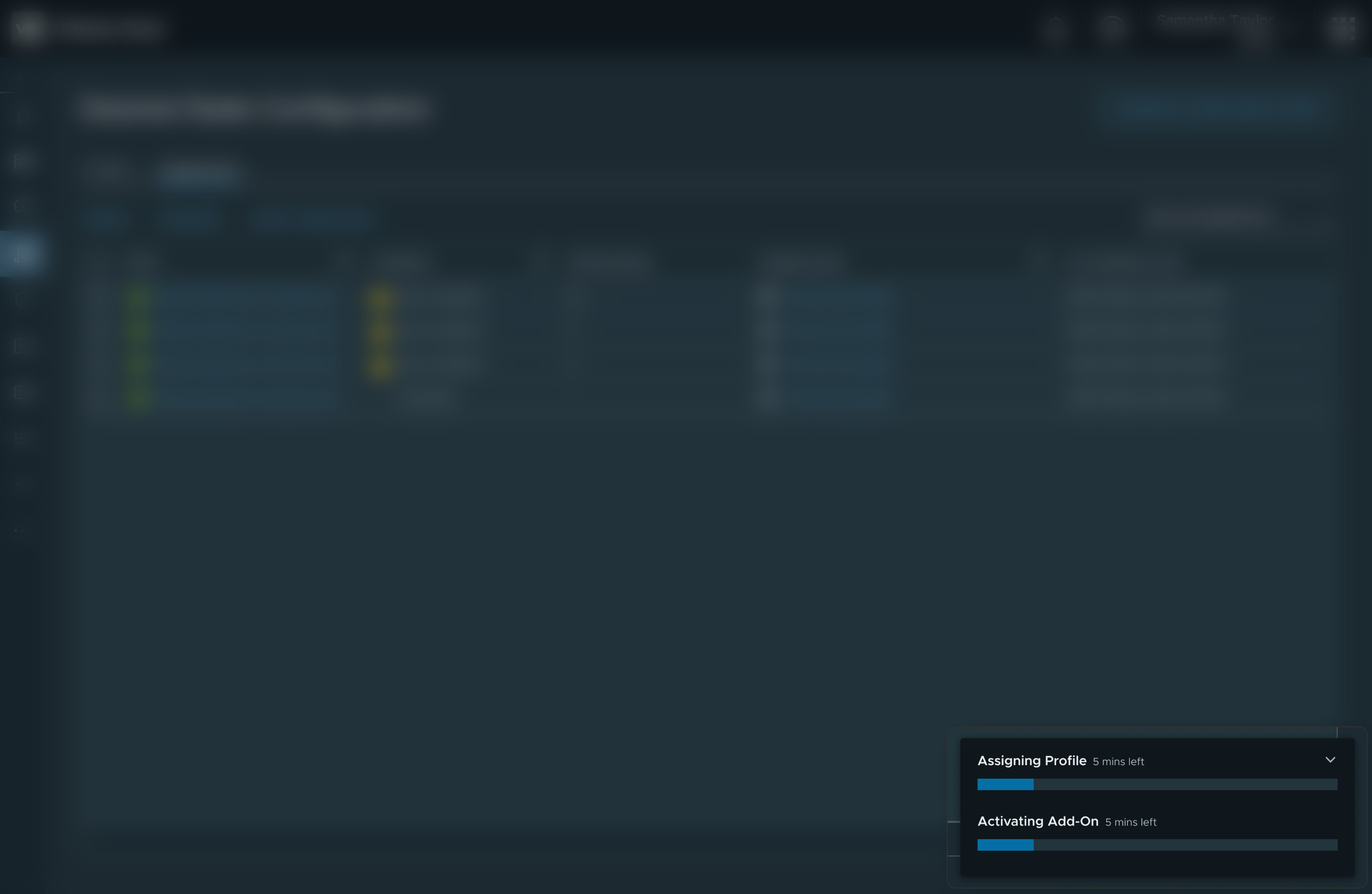
I defined a pattern for surfacing tasks globally in a collapsible view
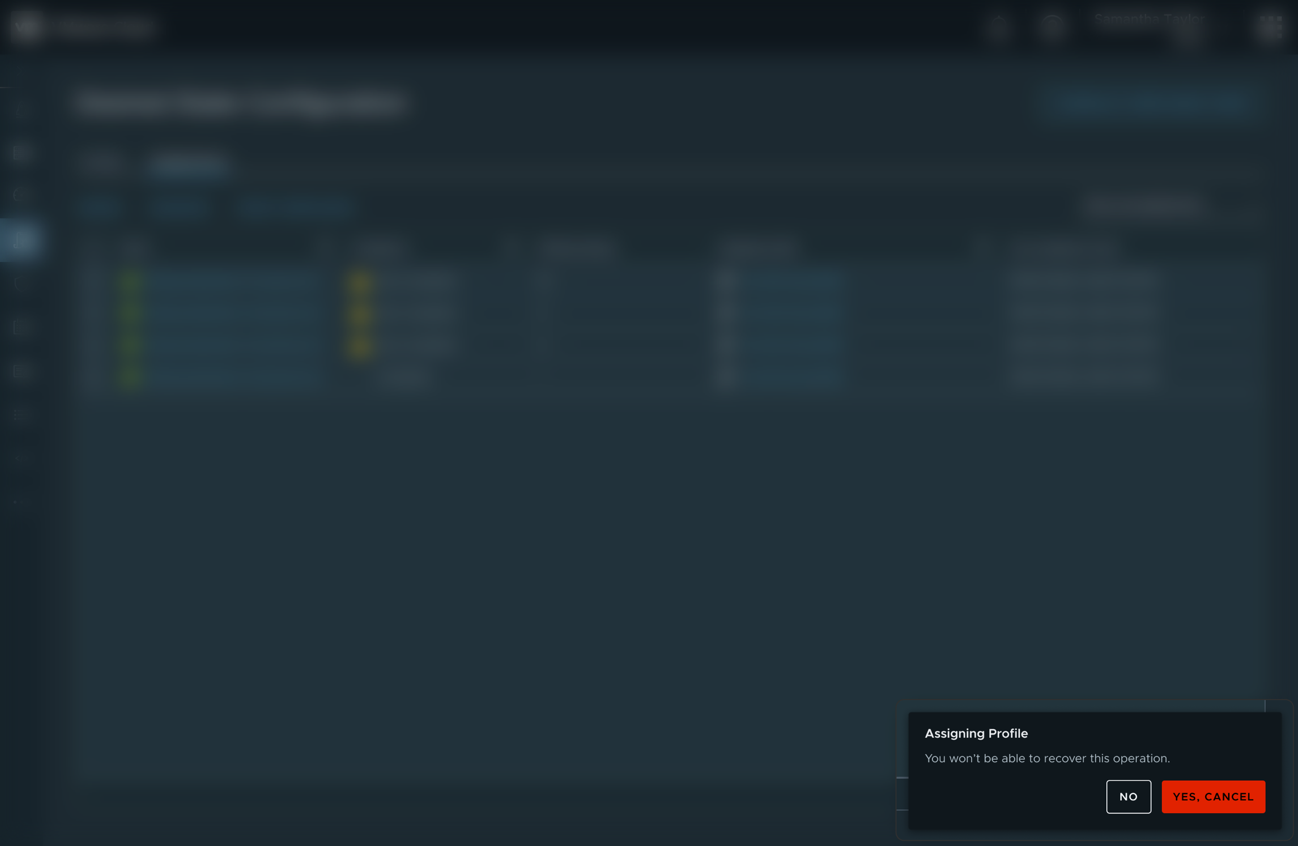
Here are some other states of the task panel























The Work
Solutions to identified pain points
 Define
 Design
 Discover
 Deliver
Specifically, I compiled …
- Internal Research
- Competitive Research View Examples
- Market Research View Examples
I then…
- Explored Design Solutions View Examples
- Whiteboarded with Colleagues View Examples
- Created Hi-Fidelity Prototypes View Examples
Specifically, I …
- Collaborated with the Research Team
- Conducted 1:1 Usability Testing
- Synthesized the Findings for Stakeholders View Examples
When finalizing the project I …
- Collaborated with Developers to Implement Interactions
- Documented Guidelines for Other Teams View Examples
- Monitored Performance Metrics on Release


I leverage a four step iterative process. Define, Design, Discover, Deliver
When defining, I look to define the problem from the user, the market, and the business perspectives.
Depending on the stage of the project, I'll then make some designs. If its early, I'll be working on high level designs; if later, I'll create something higher fidelity.
I'll then test the solution with some users and synthesize the findings.
When delivering, I'll work cross-functionally to unblock edge cases, ensure success metrics are captured, and collaborate to implement delightful interaction.

The Process
The process I follow, and how I used it to deliver this project


I worked with designers from other teams to undertand their products’ use cases and needs … Where a cacophony existed, worked to understand and assist
And accomplished cohesion across VMware for a unified vision for notifications
That system now delivers a million messages a day …
And users have responded positively to the improvements
I helped our cross-functional team stay focused on the end user in the vision and scoping phases …
… ensuring we captured important indicators of user satisfaction in the team's success metrics
Here, for example, we are capturing the percentage of notifications that are dismissed, and what types of notifications they are
That data revealed that users aren't as interested in cross-product marketing or new feature announcements. We are using that data to improve the relevancy of notifications
Finally, I worked with the design systems team to contribute parts of notifications to the Clarity Design System
While not a requirement for my role, I knew that getting it into the design system would help accomplish my goal of creating cohesion across the platform.
The design system now lives as a standalone pattern in the Clarity open-source design system.
While a few minor adjustments have been made over the years, the pattern has stood the test of time by solving for the full range of VMware Product use cases.
The documentation for the snackbar may look familiar, for example 😊.
Additionally, here's the workflow diagram I created for the long-running operation component.
A near exact replica lives on as the guideline for implementing long running operations across VMware products now and into the future.
I created a design vision informed by user pain points…
then collaborated to deliver a MVP that built towards the vision and delivered immediate business value, shipping initial versions in a few months
The second phase enabled managing notifications and configuring them for other users


The Results
What came out of the work

Thank you!
I appreciate you taking the time to review my work